
Contact Me!
Kenny Chung is a digital marketing director from Brooklyn, NY with a background in advertising and creative direction from Boston University. He most recently worked at Huge.
Additionally, Kenny is a concert photographer, omnivore, Time Magazine's Person of the Year for 2006, and he holds the same number of Tour de France titles as Lance Armstrong.
In his spare time, he plays the guitar/bass/banjo/ukulele/drums, listens to NPR, and writes scathing Yelp reviews.
Kenny blogs semi-regularly at The Frequency According to Kenneth and can be reached at ksc@kennychung.net
Effectiveness of Celebrity Telethons
The idea for this infographic came about after the Haitian earthquake, that was promptly followed by the "Hope for Haiti Now" celebrity telethon benefit. My friends and I were wondering how effective these telethons were and compiled data to find out. Four very significant disasters (September 11, the Asian Tsunami, Hurricane Katrina, and the Haitian Earthquake) were chosen, as well as their respective telethons (America: A Tribute to Heroes, Tsunami Aid: A Concert of Hope, Shelter From The Storm: A Concert for the Gulf Coast, and of course, Hope for Haiti Now). See the full sized Celebrity Telethons Effectiveness Infographic here.
Celebrity Telethons Infographic
This infographic was meant to look at several metrics that each tell a unique story in terms of donations and fundraising efficacy.
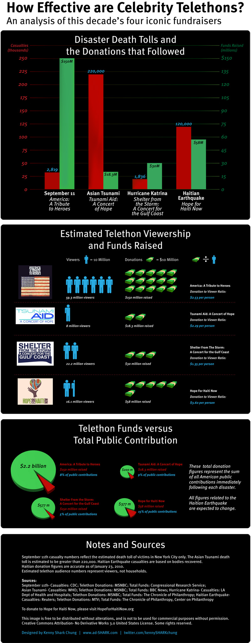
Celebrity Telethons Death and Donations Graph
This graph charted the death tolls for the four selected disasters and juxtaposed them with the reported funds received as a result of their associated celebrity telethons. Note that the dollar figures from Hope for Haiti Now were premature.
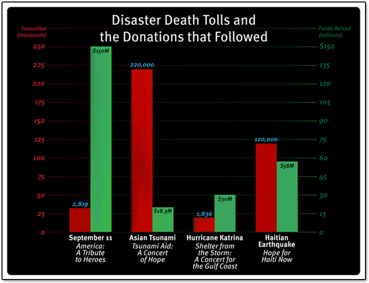
Celebrity Telethons Viewers and Money
This diagram was created to show how multiple StarWind SANs can be used to mirror and replicate data for a disaster recovery server.

Celebrity Telethons Percentage of Contributions
This final series of pie charts shows the percentage of donations that came from celebrity telethon compared to all reported American public contributions. The Haitian earthquake numbers are likely inaccurate now.
