
Contact Me!
Kenny Chung is a digital marketing director from Brooklyn, NY with a background in advertising and creative direction from Boston University. He most recently worked at Huge.
Additionally, Kenny is a concert photographer, omnivore, Time Magazine's Person of the Year for 2006, and he holds the same number of Tour de France titles as Lance Armstrong.
In his spare time, he plays the guitar/bass/banjo/ukulele/drums, listens to NPR, and writes scathing Yelp reviews.
Kenny blogs semi-regularly at The Frequency According to Kenneth and can be reached at ksc@kennychung.net
Guitar World Masthead/Cover Redesign
This project entailed the redesign of a magazine masthead and designing a cover and two-page spread to convey the new logo and themes. I redesigned Guitar World magazine, a publication I used to read regularly.
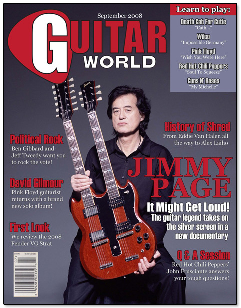
Guitar World Cover Design
This was a sample cover incorporating the new masthead as well as text & headline placement. Font choices were made to complement the logo. Note that like the original Guitar World logo, the overall hue can be changed to match a certain theme. The masthead in this instance matched the color of Jimmy Page's SG Guitar.

Guitar World Redesigned Masthead
This assignment was a combination rebranding and magazine layout exercise. I kept the two-tone theme of the original logo and only preserved the negative lettering for the G, which was now layered on top of an outline of a guitar pick.

Guitar World Spread Design
This two-page spread detailed how an article would appear in the magazine, incorporating the new fonts and themes. The "Gear Review" section header is similar to the revised masthead.
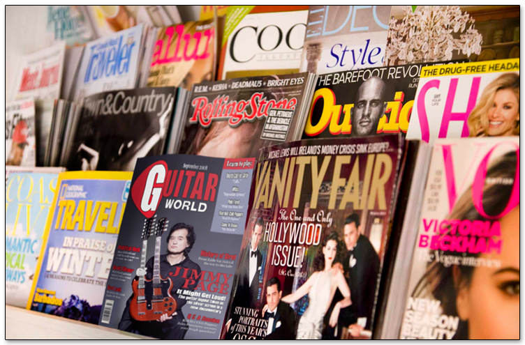
In-Store Mockup
A mockup of a magazine shelf with the redesigned Guitar World magazine on display.
