I usually keep my public shaming of corporations confined to my Twitter, but sometimes I encounter an experience so egregiously bad that I have to blog about it. For your consideration today, I present what’s probably the worst UX I’ve ever witnessed on an online payment form. This embarrassment belongs to Con Edison.
Typically, when you’re asking customers for money, you want the payment process to be as seamless and frictionless as possible. But Con Ed decided to go in the extreme opposite direction and provide the most disjointed and unintuitive system imaginable. It’s like they don’t actually want their customers’ money.
Below are screenshots detailing each major step of the process. An important note is that in order to pay your bill by credit card, you need to complete the following steps every single time. So you can see how this might get annoying. Click the images below for additional commentary.

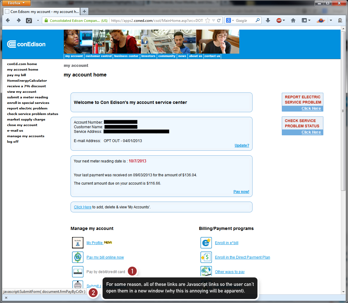
Step 1: From the start, ConEd tries to limit what you can do. Here, the links are coded in Javascript, so you can’t open them in new windows/tabs via conventional methods. This becomes increasingly annoying later on when you realize that you needed some information from your main account homepage.

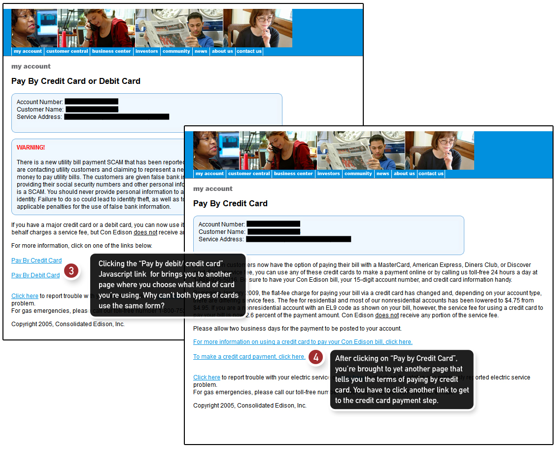
Step 1a: Even after you click on the link to pay by credit card, you’re asked two more times if this is what you want to do. Why the process needs three clicks to confirm your payment method is beyond me. But what you’ll see later on is that this doesn’t actually matter.

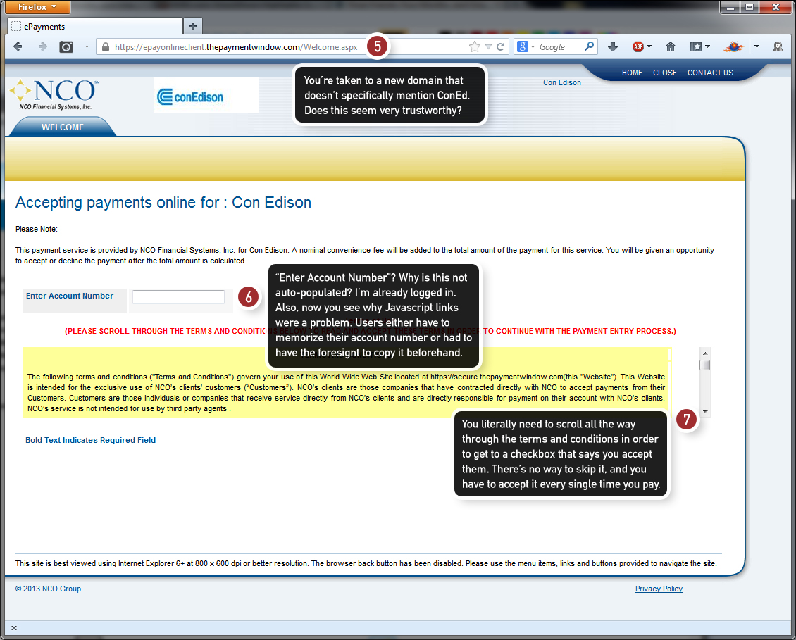
Step 2: You’re taken to a secondary domain for payment, and this site has absolutely none of your account information pre-populated.

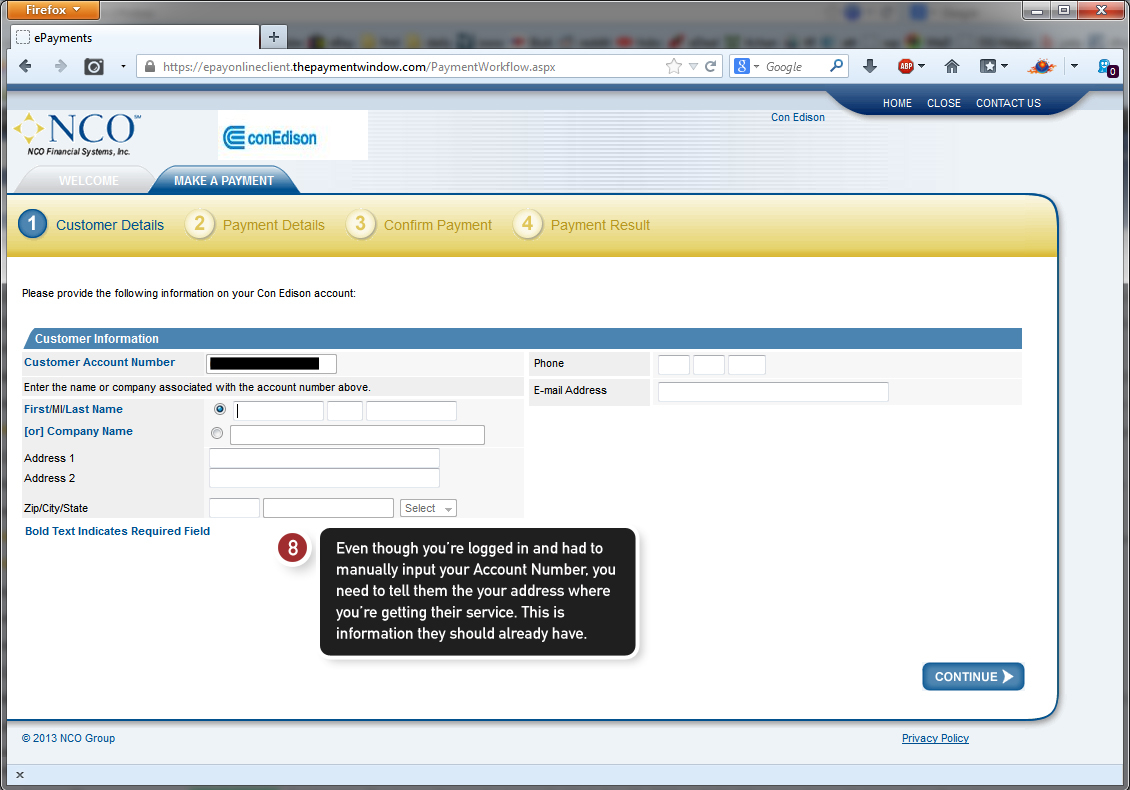
Step 3: In one of the more puzzling steps (and that’s saying a lot), you have to input your home address where you’re receiving Con Edison’s services. Mind you, this is after you’ve already provided them with your account number.

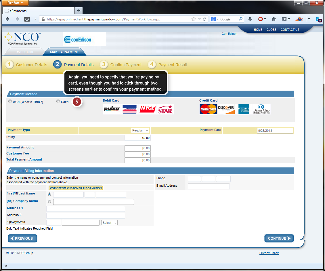
Step 4: Once again, you need to specify that you’re paying with a card. This form isn’t even specific to credit cards, despite the fact that you’ve confirmed on three separate occasions that that was your payment preference. They could’ve asked you how you wanted to pay in this step.

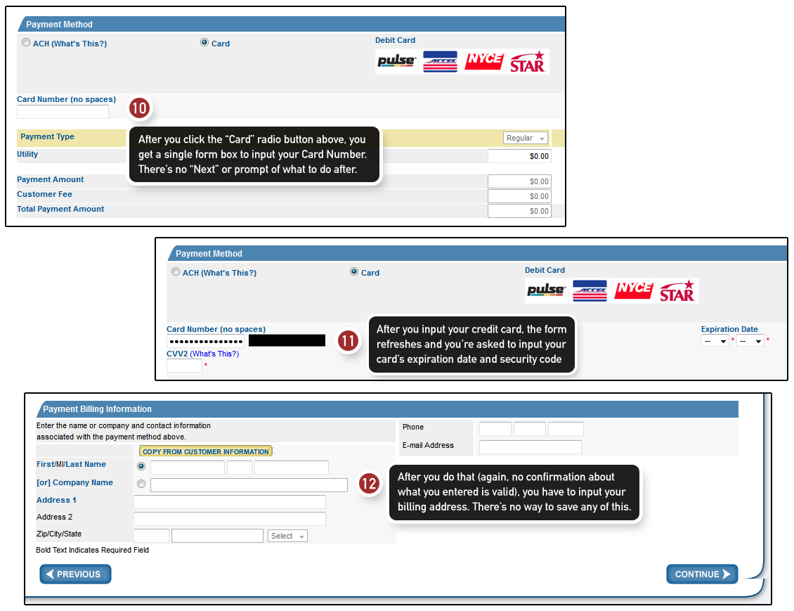
Step 4a: Now you have to input all of your credit card information in some weird self-refreshing form. Text boxes appear only when you’ve input previous data, which makes no sense. Then you have to input your billing address. There’s no way to save any of this information, so you have to do it every single time you want to pay by credit card.

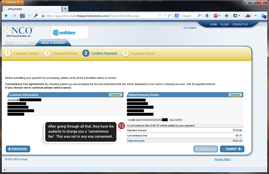
Step 5: As a final low blow, Con Ed charges you a “convenience fee” of $4.75 even though you had to go through 5 excruciating steps to give them your money. Talk about a con.
I hate you, Con Ed.

