Is the Metropolitan Transit Authority (MTA) in the process of a rebranding campaign? Everyone knows they could use some good press (there’s only so much news you can read about budget cutbacks or more potential fair hikes).
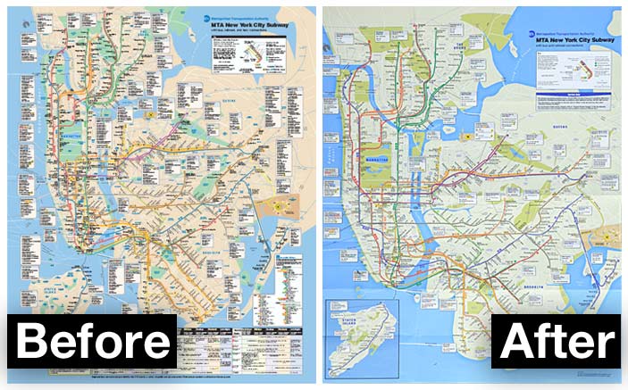
I usually use Tuesdays to critique NYC Subway advertisements, but today something else caught my eye. Take a look at the new map:

Subway map redesign (before and after)
You can immediately tell that the main colors are a bit more muted. At first, it may just seem that the brighter blue of the water makes the land look greyer by comparison, but both colors have changed. The land is now more of a concrete color, which makes sense only from a non-cartographic kind of way. But it does bring a retro look and feel to it all.
As far as the layout goes, I think it’s a big improvement. There’s more room to actually see the subway lines (particularly in Manhattan) and there’s less clutter. However, I hope they create one with as much information as the old one for the big kiosk-type maps on the subway platforms.
As far as the rationale behind redesigning the map, that’s a different story. To me, it was not worth redoing. Sure, it’ll be noticed by the experienced straphanger’s eye, but why even bother? Until something big happens like the completion of the famed 2nd Avenue line or the city finishes the new Brooklyn Nets stadium, there’s not much worth bringing attention to.
It would have definitely been a better idea if they switched the colors after they actually made noteworthy changes. It would then perform the double duty of catching eyeballs and showing progress for a perpetually floundering transit system.
And of course, I’m not a big fan of the color choice. But as fellow native New Yorkers can attest to, people will complain, get used to it, and then forget all about it. I mean, that’s how it works whenever they hike up the fares, change express trains to local, cut service…
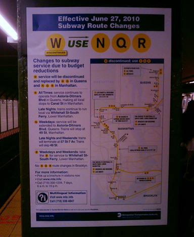
edit: I also noticed that their Service Change signs are now different color, with a new layout and printed on glossy paper. I can’t help but think that it had something to do with how easy it is to spoof Subway posters. Check out the new ones:

Redesigned Subway Changes Poster

