the frequency a kenny chung blog

It may be a bromide at this point, but “Don’t be evil” has become a suggestion rather than a mantra for the Mountain View giant Google. At the root of it, the tech titan has been outpaced by companies in other online spaces in which Google wished to also lead. In some cases, Google has returned fire in spades and succeeded. But for every Gmail, there are a few Buzz’s and Wave’s. In the past few months and years, it seems that Google has also become increasingly comfortable with implementing opt-out models for its services, despite the consequences.

Let’s start with the big one- Google Buzz. Back in February, Google launched this poor attempt at a (US-based) social network. But what’s even worse was the way users were brought into the system:

Axiom #1: Google wanted all of their users to join Buzz.
Axiom #2: Google had already built up a ton of Gmail users.
Conclusion: Everyone who uses Gmail should automatically be opted into using Buzz.

The way this was done was a huge privacy oversight and a case study on how to alienate everyone. Not only did users see that they were opted in after Buzz launched, but they also soon found that the default settings made all of their mail contacts publicly accessible. You can imagine how this would be a problem for doctors corresponding with patients, men keeping in touch with ex-girlfriends, and people networking with recruiters to change jobs. In short, it was a privacy policy and a public relations nightmare.
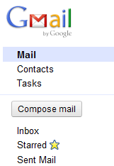
Gmail Compose buttonNow, not every Google product launch arrives with such fanfare or contempt. But Google does have a long history of rolling out services, redesigns, algorithms, etc. in extremes and then inevitably scaling back after some much deserved negative feedback.

While this isn’t inherently evil, it can lead to bad User Experience. Just this past month, Google relaunched its Image search and redesigned the Gmail sidebar. I won’t delve into the plethora of reasons why I dislike the new Image search (it all comes back to Google Page Load time and bad UX), but it was a drastic change and people had no choice when it was initially rolled out. And now, almost all Google users have to deal with it. More recently, Gmail was redesigned with social/user connections at the forefront. Contacts and other Google services were emphasized over actual mail options and filters. The only update remotely mail-related was changing the “Compose mail” button into a clunky Web 1.0 grey box. While I understand the importance of maintaining a consistent brand experience, a lot of these changes don’t help most users. But does Google care?

Recently, there has been a lot of talk about companies being “too big to fail.” With entire industries contingent upon its search engine, Google definitely falls under this umbrella. Barring regulatory review, I don’t foresee any changes in Google’s opt out model practices unless the changes affect litigable issues like Terms of Service or Privacy violations. In general, with Google as powerful as it is in its specialized sectors, there’s little anybody can do about it besides send angry e-mails or blog about it.

In his book “Predictably Irrational,” Dan Ariely recounts one of his most famous observations regarding the prevalence of organ donors across different countries. You can read more about the organ donation phenomenon on his blog, but the basic gist is that countries with an opt-out model have significantly more citizens registered as organ donors. Compare this to places like the United States, which has an opt-in model (you have to check a box on the back of your license to become a donor). The proof is in the pudding- people are lazy. That’s oversimplifying it a lot, but the bottom line is that the path of least resistance is usually the most appealing to the majority of people. Making that extra check mark or reading every line on a form is not worth those precious seconds of mental processing.

Why do I bring up this study? Because the propensity to gravitate toward inaction cuts both ways. By changing the options, you can influence how users opt in or opt out of actions/services at drastically different rates. But to quote Spider-Man’s fictional uncle, “with great power, comes great responsibility.” As I’ll explain later, the ability to affect actions doesn’t always help in the way you might have hoped.

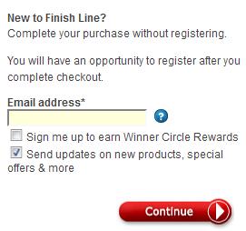
Let’s start with a simple example: consider your typical eCommerce shopping cart system. Buyers reach a registration screen, where they have the option of signing up for a free, optional newsletter. There will be a percentage of people who completely glaze over the option. There will also be a percentage who will actively check or uncheck the box to indicate whether or not they want it. If you only care about more subscriptions, a pre-checked box is the way to go.

Where can a pre-checked box go wrong? Just ask all the people who, at one point or another, ended up with a Yahoo or Ask toolbar on their computers by accident simply because they wanted to install a program or browser plugin. While it is perplexing to novice users who can’t figure out why they’re losing web browser real estate, it is downright infuriating for computer savvy individuals who impatiently click the “Next” button waiting for installation to begin. This is where you can hurt your brand. Your service can be labeled spammy or adware. Some will view it as an underhanded (and downright desperate) tactic to have people use your product. It also violates people’s privacy (as users did not explicitly give permission to install, which is, in a way, kind of like the opposite of organ donation).

So back to newsletters. Everybody wants to believe that they have the best, most useful, awesome newsletter; but this simply is not the case. For example, I used to subscribe to Flavorpill, but realized it consisted mostly of thinly veiled advertisements and self promotions. On the other hand, I know many people who swear by Gilt Groupe’s newsletters on daily deals and spend inordinate amounts of money as a result. If you actually do have a good newsletter, then you’re fine. You might get some accidental subscribers who recognize the quality of your work and its utility, and you’ll also have subscribers who receive exactly what they were expecting.

But take for example concert ticket e-mails. I subscribe to Ticketmaster and LiveNation for the off-chance that I’m unaware that a band I like is playing in my area. Both do DMA-style targeted newsletters which are also genre-specific. But I also end up randomly getting single e-mails about a Nickelback or Jonas Brothers concert. Every time I get one of those, I want to unsubscribe.

There are many ways to create a bad newsletter: be too text-heavy; be too generic in your content offerings; don’t include any accompanying visual aids/pictures; don’t make your links readily available and clickable; don’t include a call to action; include important information below the fold, etc. Those are mostly design aspects, but there’s also an important marketing piece- who do you actually want subscribing to your services?

There are so many ways to demo target: retarget users and a serve popup ads; run SEM campaigns on specific keyword phrases that indicate who a person is likely to be; utilize social media channels for awareness campaigns to reach certain types of readers, etc. With all of these other, much better, tools at one’s disposal, is it really prudent to automatically opt everybody in every time? Are you even using the best metrics? That is, do subscription events matter when 75% unsubscribe after their first email? What if the people who stay subscribed never click through to the site? Retention rate would be a lot better KPI, but still not the most efficient. If you’re not sure who wants your content delivered to their inbox, then let users opt in, and also do a better job of targeting them across different interactive media.

Also, stop trying to make us install your resource-hogging toolbars!

My next blog post will single out a particular company that follows the opt-out model (and alienates a lot of users in the process). Are they too big to fail? Are they doing evil? Stay tuned to The Frequency to find out!

July 29th, 2010
according to

If you’ve been wondering why I haven’t been writing much lately, there are a couple of reasons:

Firstly, I’ve been super busy at my (more or less) 9 to 6 job, consulting SEO clients and putting out fires.

Secondly, I’ve been completely redesigning my portfolio site! By now, Ad-SHARK.com has been totally revamped to be a lot more informative and intuitive.

So why did I redesign? In short, because I had to. The original site was a pile of loosely organized image pages that I created in a week in anticipation for visiting ad agencies back in March of 2009. And as it did not age well with its dated design and poor Information Architecture (not to mention poor SEO!), I felt it was not the best representation of myself as a professional or my abilities.

So I spent a couple of months compiling design ideas in the back of my mind and then spent a few weeks actually hand-coding and Photoshopping everything. And I must say, I’m quite proud of my work. In fact, if it weren’t so meta, I’d include my site as a piece of my portfolio on the site itself.

I feel this new design-centric and search engine and user friendly site does a much better job of conveying the duality of my professional skills.

So take a look around the new and/or improved Portfolio of Kenny Chung. Let me know if you have any suggestions, and maybe hire me for a design job sometime!

Amazon purchased the deal site Woot.com, which was in itself a pretty big deal (figuratively and literally). Right after the acquisition was finalized and made public, Woot inserted a line in one of their item descriptions about how the Associated Press owed them money for quoting Woot CEO Matt Rutledge. Woot copywriters (and whoever approved it) were poking fun at the ludicrous pricing model the AP implemented months ago to battle Google News and to monetize aggregator sites (I wrote a post about it in August 2009 titled “Seriously, Associated Press?“).

Now, I wish this were the end of the story. But it wasn’t, and I’m torn on how I feel about what happened next. AP released an oh-so-serious statement in response to Woot’s joke, saying they quoted Rutledge with permission and weren’t to be held to any quote pricing. Oh, and they also pulled the oil spill card in doing so.

So, on the one hand, this made for a very entertaining Internet battle, with bloggers and social media addicts tearing the AP apart for their overreaction. Reddit had some fun coverage about the issue as well.

However, as a student of Mass Communication, it made me a bit sad (and embarrassed) to see how poorly handled the situation was, not to mention how it showed desperation on the part of AP to cling onto what dignity it had left.

Oh, and there are also the issues of shoddy journalism and utter Public Relations fail. Anybody could do a simple Google search on Woot to discover that the nature of their editorial content is facetious at worst and lighthearted ribbing at best. To turn a joke into a serious matter was a huge communication mistake, and AP pretty much openly invited the criticisms of Woot loyalists and people who were just plain Internet savvier than the AP.

This was potentially an excellent PR opportunity for AP to set themselves apart from the rest of the struggling online news industry. Sure, they could have dismissed Woot’s allegation altogether or called shenanigans. But they could have also played along. The AP could have written an equally silly response to Woot to show that they have a sense of humor and “get” how the Internet works.

But alas, it was a poorly mishandled Mass Comm and PR trainwreck.

Is the Metropolitan Transit Authority (MTA) in the process of a rebranding campaign? Everyone knows they could use some good press (there’s only so much news you can read about budget cutbacks or more potential fair hikes).

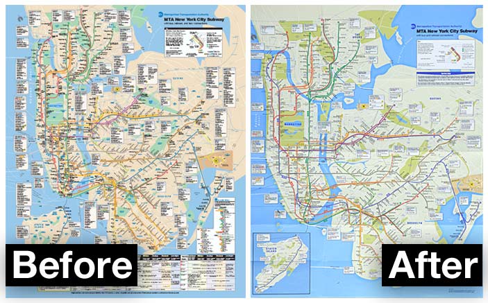
I usually use Tuesdays to critique NYC Subway advertisements, but today something else caught my eye. Take a look at the new map:

Subway map redesign (before and after)

You can immediately tell that the main colors are a bit more muted. At first, it may just seem that the brighter blue of the water makes the land look greyer by comparison, but both colors have changed. The land is now more of a concrete color, which makes sense only from a non-cartographic kind of way. But it does bring a retro look and feel to it all.

As far as the layout goes, I think it’s a big improvement. There’s more room to actually see the subway lines (particularly in Manhattan) and there’s less clutter. However, I hope they create one with as much information as the old one for the big kiosk-type maps on the subway platforms.

As far as the rationale behind redesigning the map, that’s a different story. To me, it was not worth redoing. Sure, it’ll be noticed by the experienced straphanger’s eye, but why even bother? Until something big happens like the completion of the famed 2nd Avenue line or the city finishes the new Brooklyn Nets stadium, there’s not much worth bringing attention to.

It would have definitely been a better idea if they switched the colors after they actually made noteworthy changes. It would then perform the double duty of catching eyeballs and showing progress for a perpetually floundering transit system.

And of course, I’m not a big fan of the color choice. But as fellow native New Yorkers can attest to, people will complain, get used to it, and then forget all about it. I mean, that’s how it works whenever they hike up the fares, change express trains to local, cut service…

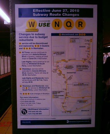
edit: I also noticed that their Service Change signs are now different color, with a new layout and printed on glossy paper. I can’t help but think that it had something to do with how easy it is to spoof Subway posters. Check out the new ones:

Redesigned Subway Changes Poster

Creative Commons License
licensed under a Creative Commons Attribution-No Derivative Works 3.0 United States License.